How we tested the usability of Card Case
We care about making products people can use. Although that sounds obvious, many companies don’t bother testing their apps. That’s how simple design mistakes creep up into software.
Testing the usability of an app can be done at any stage, even if you have just a low-fidelity prototype. In our case, we were working on a showcase app called Card Case. Since it’s a simple app and it involves multiple phones interacting, we decided to validate it after building the first version.
We’re going to show you how we did it and the results we got. We hope to convince you to test your apps as well :)
Preparation
First, we identified the main use cases we wanted to test. The use cases that, once completed, will give the user a full understanding of the app's value. Since it’s an app for exchanging your business card information, we wanted to make sure people could:
- Create their own card
- Exchange their card with other people
Next, we wrote down the target audience for the app:
- Professionals that share their contact information with other people regularly (once or twice per month, at least)
- Android phone owners
- Comfortable with the English language
- Not designers or developers (they build apps as well, so they don’t have the average user skills)
We booked a meeting room at the local company incubator as our stage. Then, we contacted people who matched our target audience, in order to schedule testing sessions. To make things easier, we started with people we knew and already worked there.
Testing
We did 7 sessions of 20 minutes each. Each session had 2 rotating members of our 4 person team. This way, everyone participated and added their own perspective to the results.
During each session, we used a script we wrote, with 3 sections:
- An introduction to explain the goals of the session and what was going to happen;
- A few general questions to find out more about the person and their business card habits;
- The actual app usability testing script and a set of tasks the person will perform when using the app;
One of us would read the script while the other managed the sound recording and took notes. This particular test also required 2 more phones nearby, to exchange cards with.
We tried our best to ease the pressure from the situation and relax the person doing the test. If the subject is comfortable, the test should feel like a genuine interaction.
In the end, we offered a small token of our appreciation to our friends and test subjects.
Results
After the sessions, we compiled all the answers, notes, and sound recordings. First, we wrote the individual notes of each session. Afterwards we aggregated results into 2 tables:
| Problems | ||
| Description | Severity (low, medium or high) | Possible solutions |
| Suggestions | ||
| Description | Implementation effort (low, medium or high) | Will be included on current release (yes or no) |
The most pressing problems we found were:
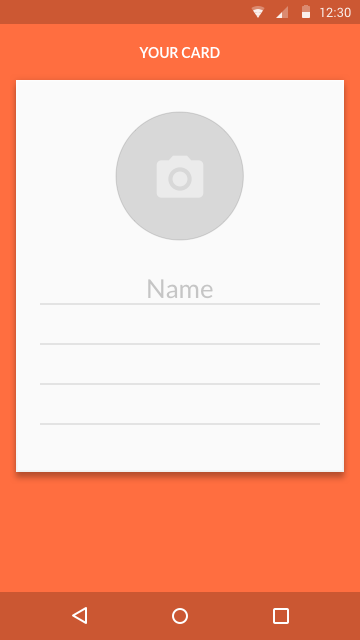
- Figuring out what to write down on your own card
- Solution: Besides the name, the card only had empty fields. We added the two most common fields after that: email and phone.
- Identifying that everyone's phone must be sharing at the same time, in order to exchange cards.
- Solution: We added a note about it on the exchange screen, that disappears after the first card gets exchanged.
- Realizing the app is searching for other cards, after opening the exchange screen (something that might take a couple of seconds)
- Solution: Change a waiting blinking icon to a native Android loading animation, for a clearer sense that the app is doing something in the background
Additionally, we found and corrected a bug with a blank state.
Since this was a simple app, we decided not to do another usability test. Multiple rounds of usability tests are a common practice for most products, to validate the solutions and test new use cases. But, just with this one usability test, we were able to learn and improve the app into its current form. (A big thanks to all our testers!)
Watching people struggle using the product you've built is an unpleasant experience. But it’s required to identify problems early on before you release a product. And, although usability testing has many steps, it’s a simple procedure anyone can follow.
Want to test your product and need help? Get in touch with us.
Our resources:
- Rocket Surgery Made Easy – The Do-It-Yourself Guide to Finding and Fixing Usability Problems by Steve Krug
- Usability Test Script – Reprinted from Rocket Surgery Made Easy, 2010 Steve Krug
- Usability Testing Checklist – Reprinted from Rocket Surgery Made Easy, 2010 Steve Krug


