Presenting Cabinet to the World! 🚀
At the beginning of this year, we noticed a common problem: searching for a great Android app is not easy or matches expectations. That’s what lead us to design Cabinet: a directory of apps that does not disappoint, without false marketing or rankings based on the number of downloads.
This project started out as my (Liliana) internship project at Bloco. With help and collaboration from the whole team, now it’s ready for everyone.
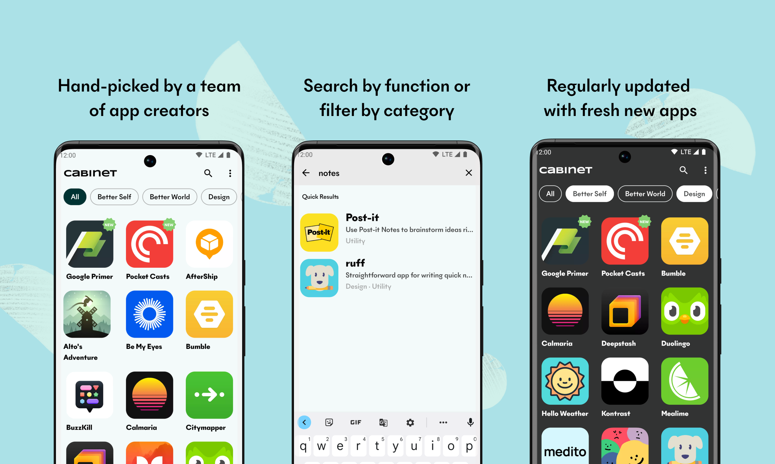
We’ve organized our hand-picked apps into categories, made them searchable, and written a description of why we think they’re great. After some discussing, we ended up with these six categories:
- Utility: for apps with daily usefulness;
- Better Self: apps to focus on personal growth and self development;
- Design: beautifully designed apps, with a great UX;
- Open Source: apps with public source code;
- Better World: apps with a focus on community and the greater good;
- Games: well-built, ethical, and fun games.
Here’s how Cabinet looks:
How was the launch?
When we finally launched Cabinet, even with our own uncertainties, we did some things right: we were #12 on Top Paid Apps in Portugal, and nothing makes us prouder. But we are still at the beginning of this journey and we will certainly learn more lessons.
Why a paid app?
The apps we build are also opportunities for us to learn more about app business models. So we wanted Cabinet to become our first paid app. It will push us to:
- Update the app directory regularly;
- Increase the quality of the app over time with features updates;
- Have a different marketing plan.
These challenges appeal to us and we are very excited to tackle them.
How was it made?
A project started from scratch has Room to try new (or just different) things. Especially when the Android development work is changing rapidly. Cabinet was no exception. We started the project from our Android Template and adapted it to the tasks that arose. But, of course, we decided to try a lot of new things, such as:
- Our first project with Jetpack Compose;
- Paging 3 for our app list (and (kinda) hated it);
- Data Store to save user preferences;
- Ktor to network requests;
- Coil to image loading;
- And so much more..!
We are very happy with this launch and look forward to how Cabinet will evolve. But, for now, get it on Google Play and tell us what you think!


